
Ann Arbor District Library
Problem Statement: The Ann Arbor District Library (AADL) currently uses check-out kiosks on site. AADL patrons are unable to efficiently and effectively check out library materials. Thus, they avoid the kiosk altogether or request additional assistance—especially those who struggle with technology. Our project team hopes to better enable patrons to achieve their desired tasks without asking for additional help. Additionally, we want to allow users equal opportunity to use the kiosk with enhanced accessibility.
Team Structure: Part of a student team with two other UX Designers/Researchers. Presented our project progress to our capstone class (students and faculty) and our AADL contact on a weekly basis.
My Role: UX Researcher and Designer
Tools: Figma
Deliverables: Digital Prototype and UX Specification Report
Timeline: 9/2018 to 4/2019
Recognition: The AADL Kiosk Interface Redesign project won the honorable mention Ford Fund Community Engagement Award at the UMSI Exposition.
AADL Kiosk Interface
Research
Research Goals: The research goals are rooted in our overarching project goals. All of the user research methods touch on the research goals at some level. Additionally, the research goals guided the questions and methods used to gather user data.
Determine the best practices of kiosk interface design to improve the efficiency, accessibility, and usability of the AADL kiosk
Identify the existing usability problems—interface issues that prevent patrons from achieving their desired task.
Determine whether patrons are able to complete all desired check out tasks and the most common pain points when unable to complete all desired tasks.
Identify what patrons are hoping to accomplish with the kiosk.
Competitive Analysis: Our group evaluated kiosks at analogous and direct competitors according to a set of metrics. From this, we identified the best practices according to our metrics and noted them for our design.
Heuristic Evaluation: We visited AADL and used a custom set of heuristics to evaluate the interface. We chose nine of Nielsen’s heuristics and added two of our own heuristics. We were able to determine the current design violations and address them in our interface design.
Patron Surveys: The survey responses provided an overarching sampling of the AADL patron demographic. Most importantly, it informed us of the tasks users are unable to complete due to existing UX issues. We also gained a first person perspective on the kiosk usage experience and the kiosk’s level of usability.

Staff Interviews: The staff interviews provided a patron and staff perspective on the kiosk usage experience. We further learnt about the tasks users are unable to complete and the range of patron technological literacy. Additionally, the staff described their own experience with the kiosk.
Analysis: The results from the research methodologies was organized within an affinity diagram. The groupings allowed our group to derive overarching themes—Convenience, Independence, Physical, and Process. The affinity diagram themes directly influenced our design requirements.
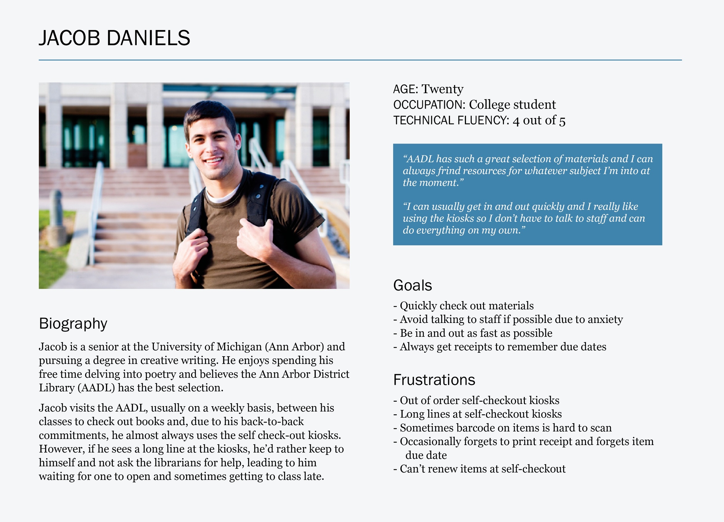
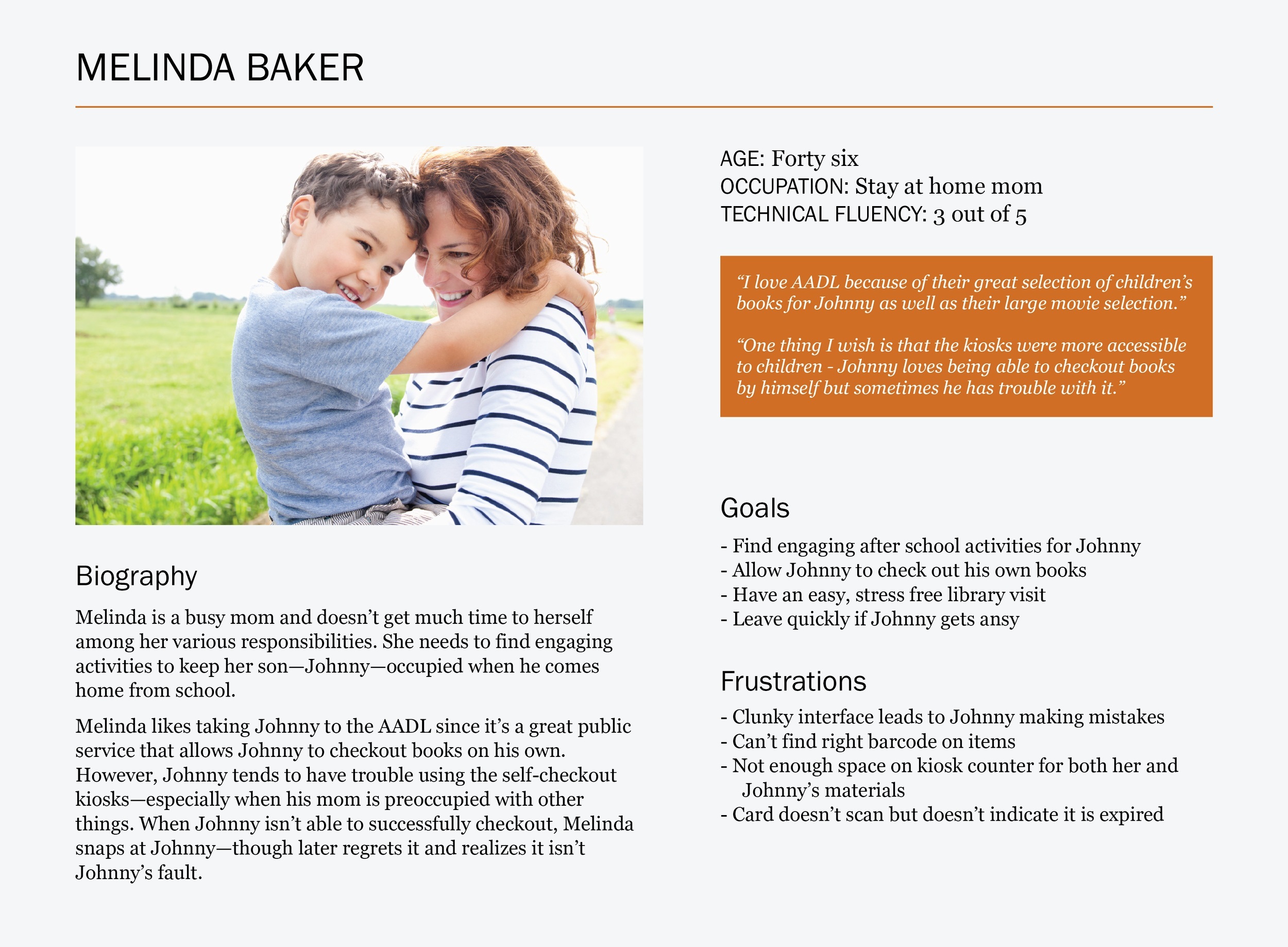
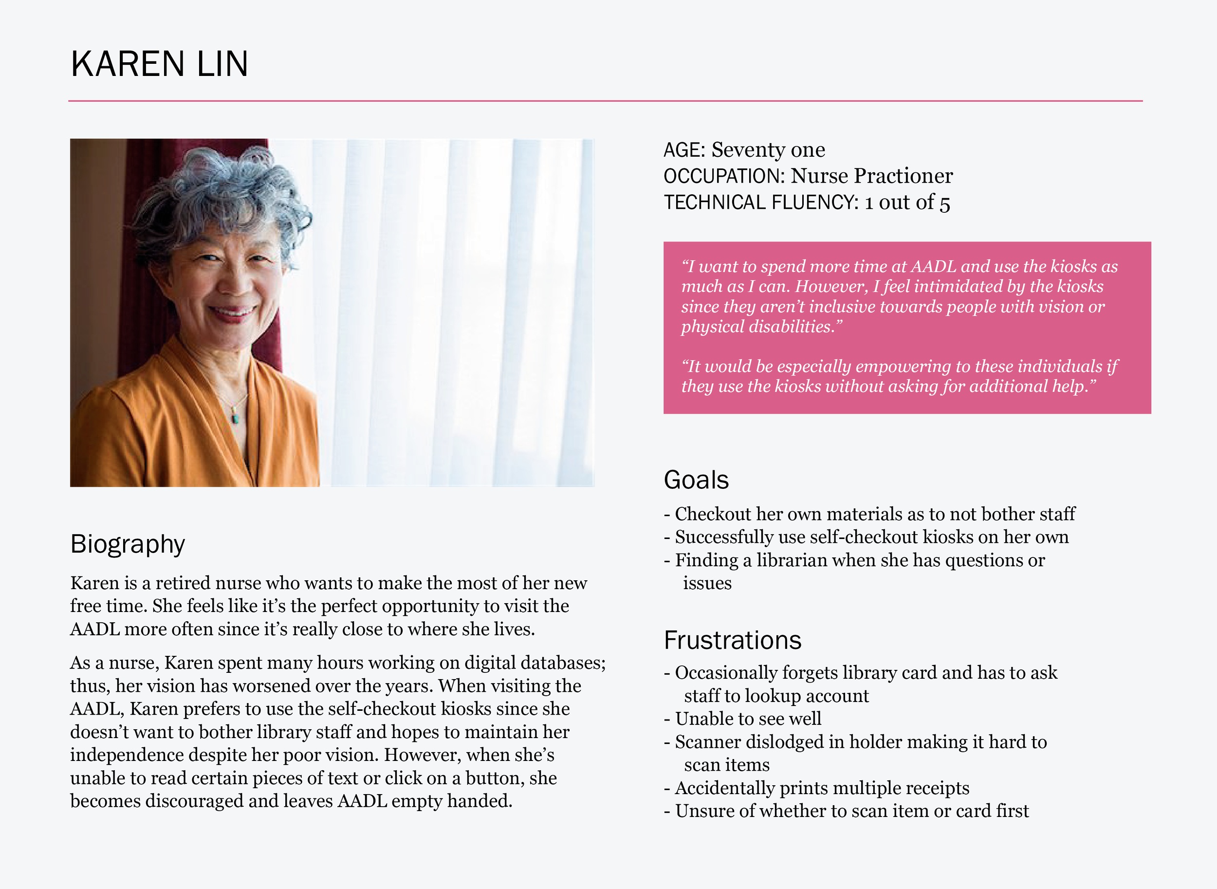
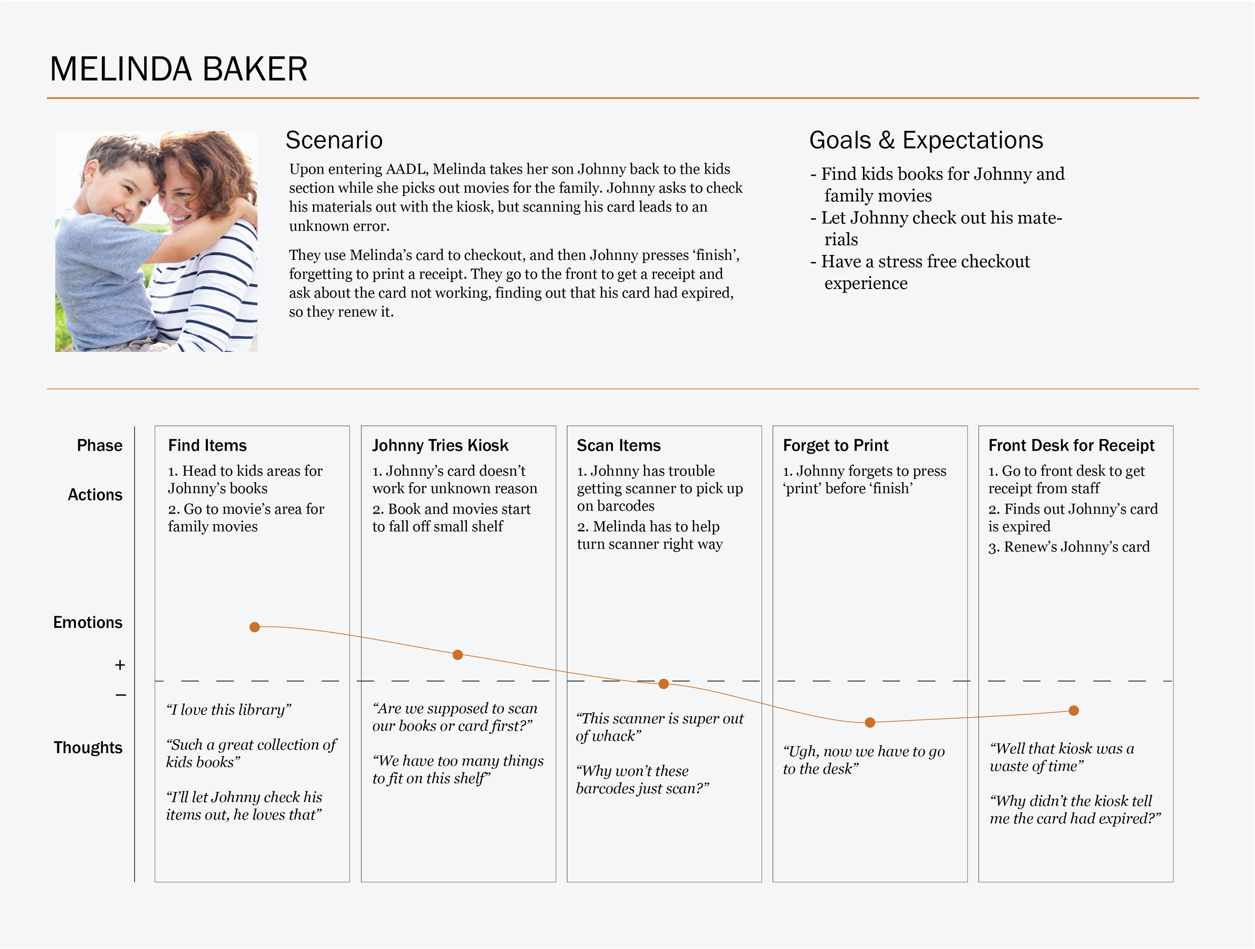
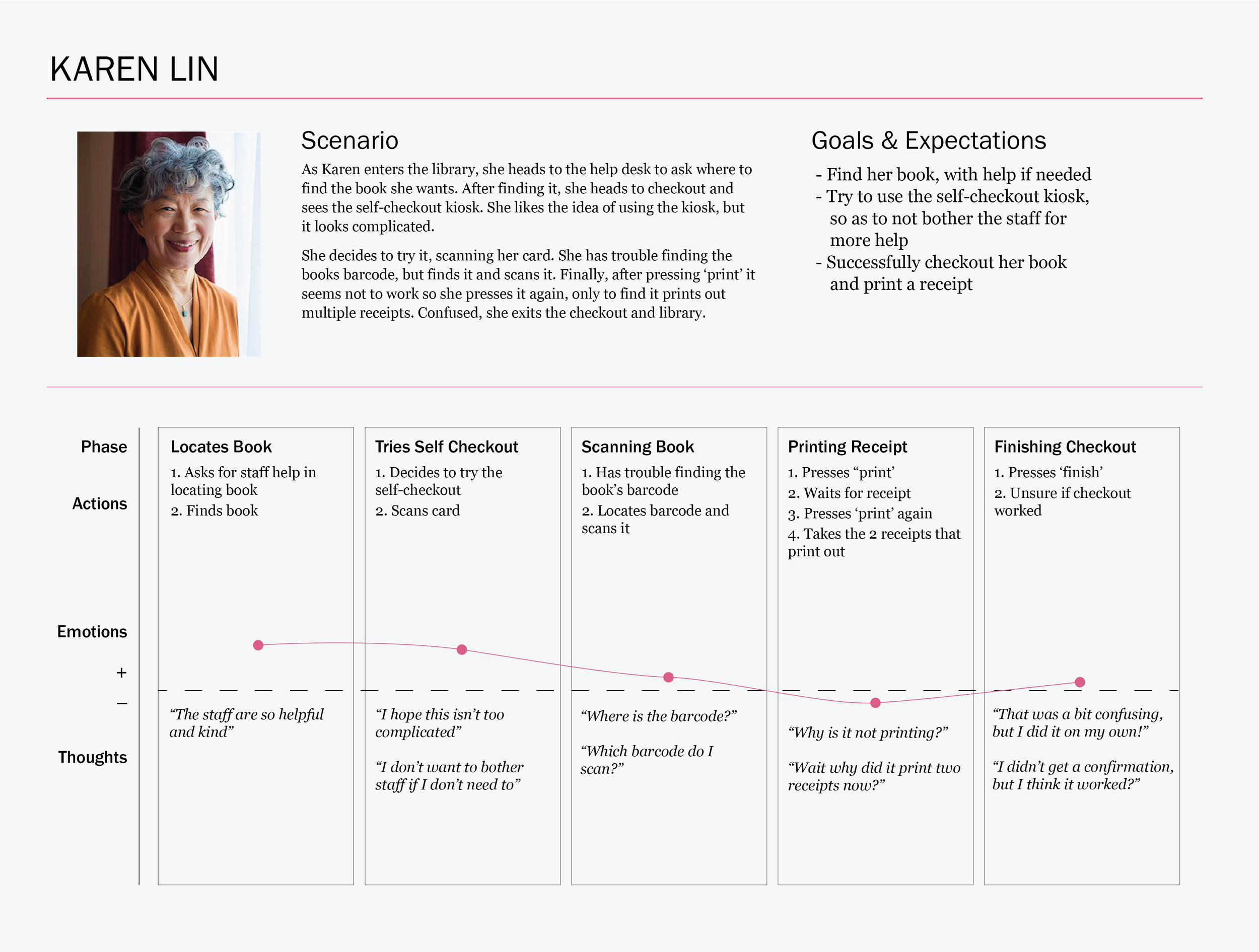
Personas: Based upon the user data gathered from interviews and surveys, our group developed three personas. The personas represent a diverse demographic. Thus, each persona experiences different goals and frustrations during the self-checkout process.
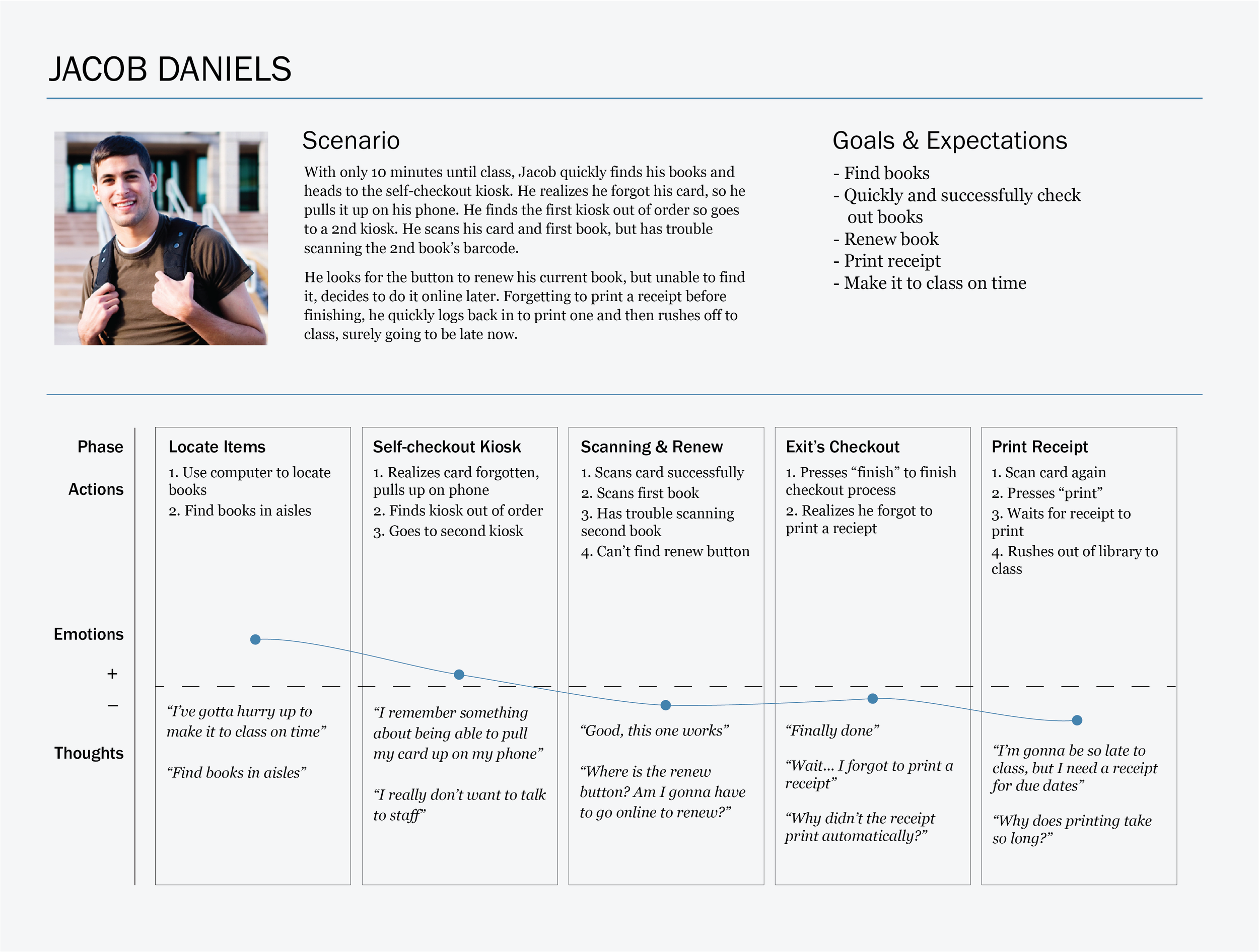
Journeys: Our user journeys reflect the various actions that each persona would complete during the self-checkout process. Through analyzing each persona’s thoughts and emotions in each phase, our group was able to rationalize our design decisions at each stage.
Design Requirements: Our design requirements are grouped within the affinity diagram categories. A majority of our necessary requirements are within the Independence and Process sections and address our goal of fostering autonomy during the self-checkout process by designing a clutter-free user flow.
Independence
Not affecting others: Clear, consistent messaging throughout self-checkout process.
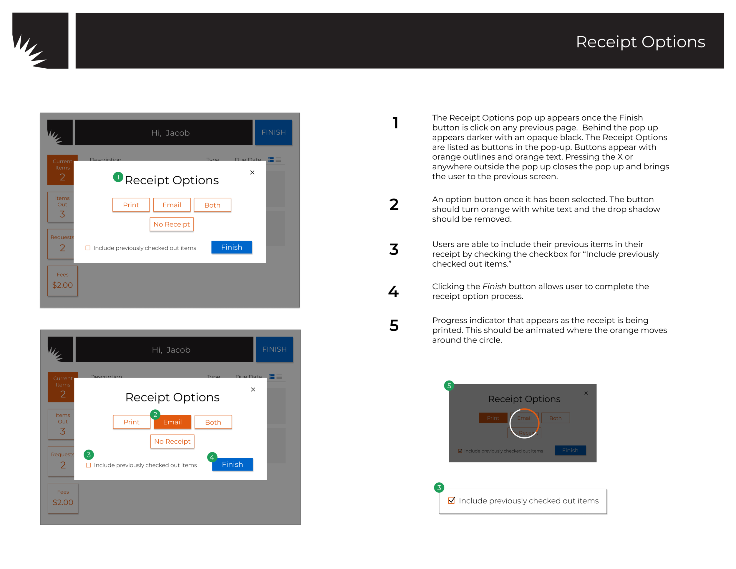
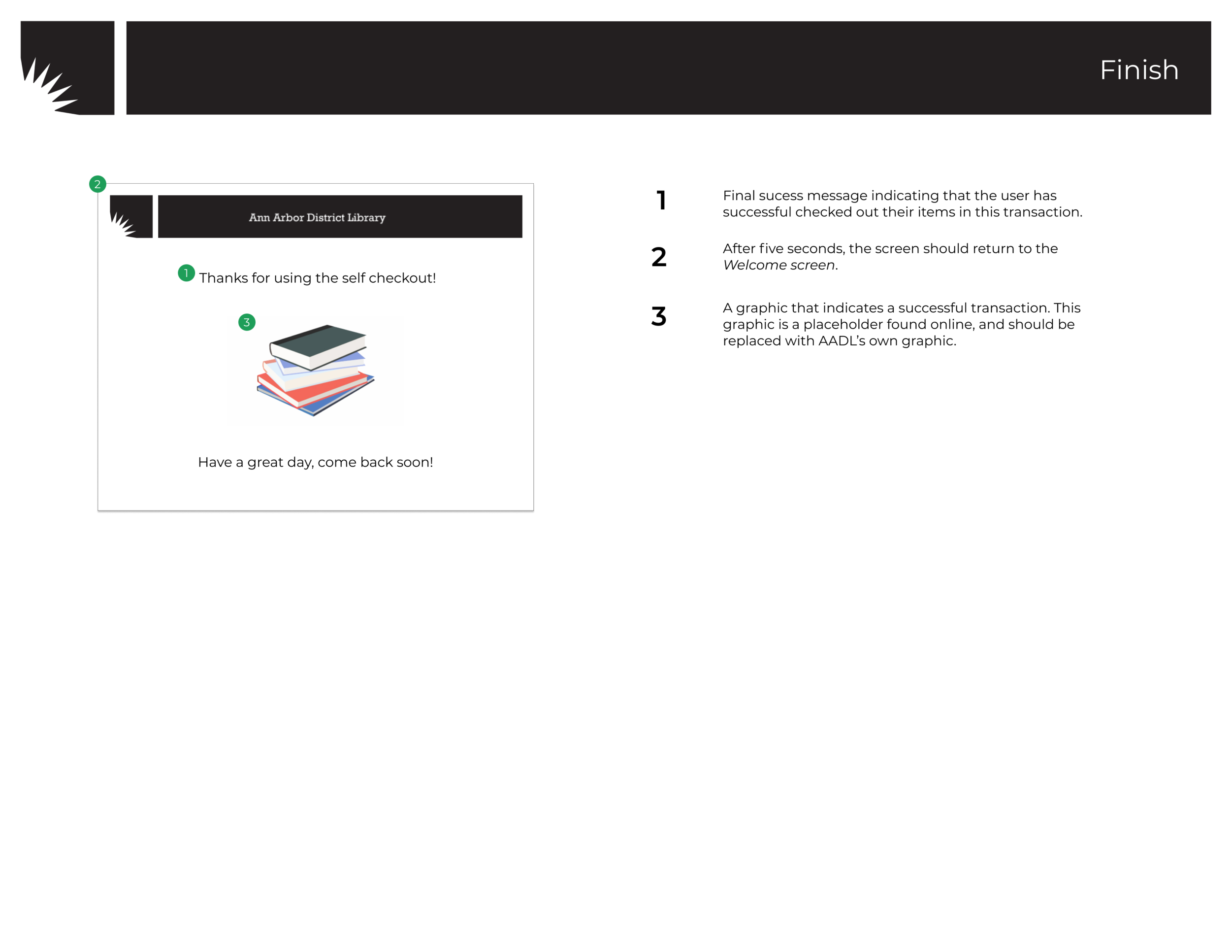
Self-governance: Indicator of account card expiration. Indicator of transit items. Indicator of already scanned items. Final success page of a complete checkout.
Process
Account: Maintain the functionality of being able to view item holds. Maintain the functionality of scanning items. Maintain the functionality of viewing AADL account information. Maintain the functionality of being able to view current fines.
Messaging: Change library jargon to understandable terms. Adhere to AADL visual brand guide.
External Factors: Add renew items functionality. Indicator of MelCat items.
Design
Design Space Analysis: From our design requirements, we developed a set of core design questions. For each question, we listed possible interface design options. Then our group analyzed its positive and negative attributes and were able to make informed decisions when sketching.

Sketches: My group sketched out the interface design possibilities from our design space analysis. We considered the different stages of the self-checkout process and error situations.
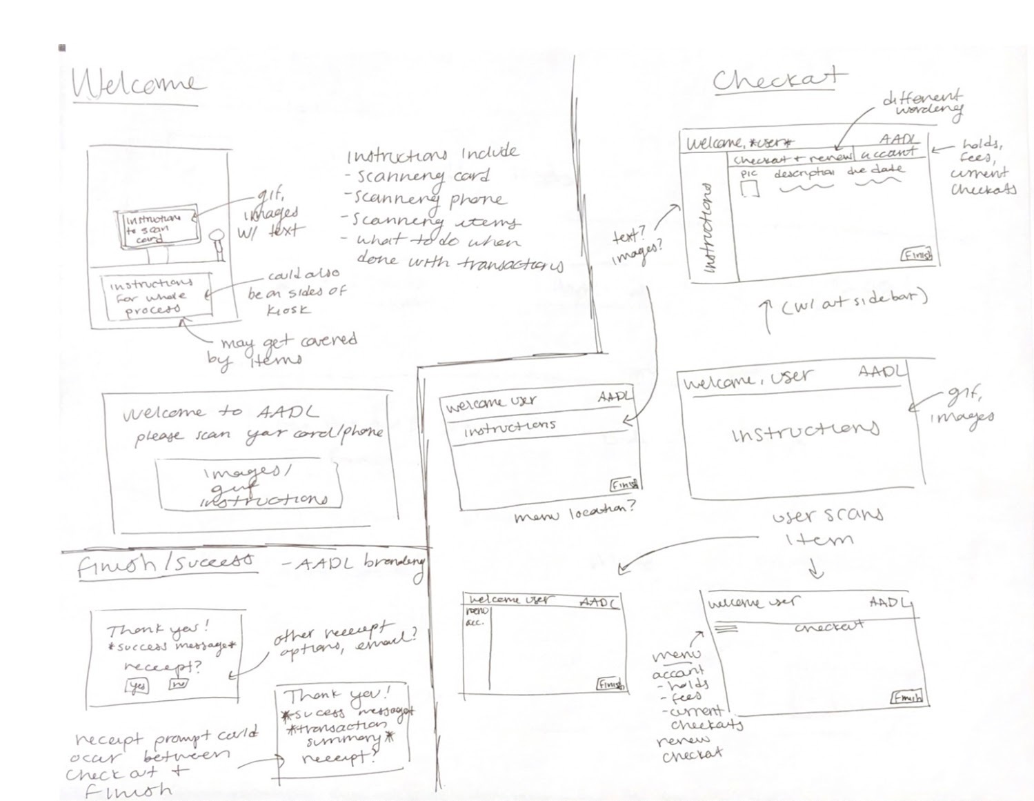
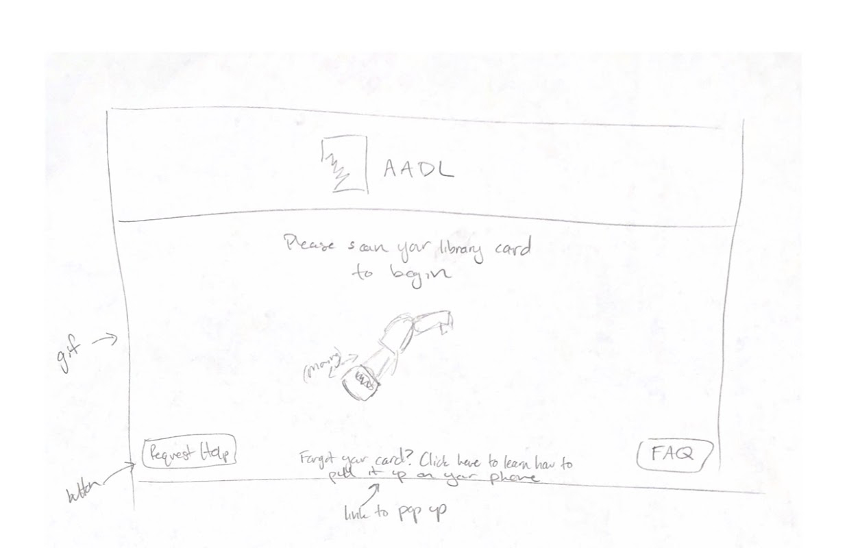
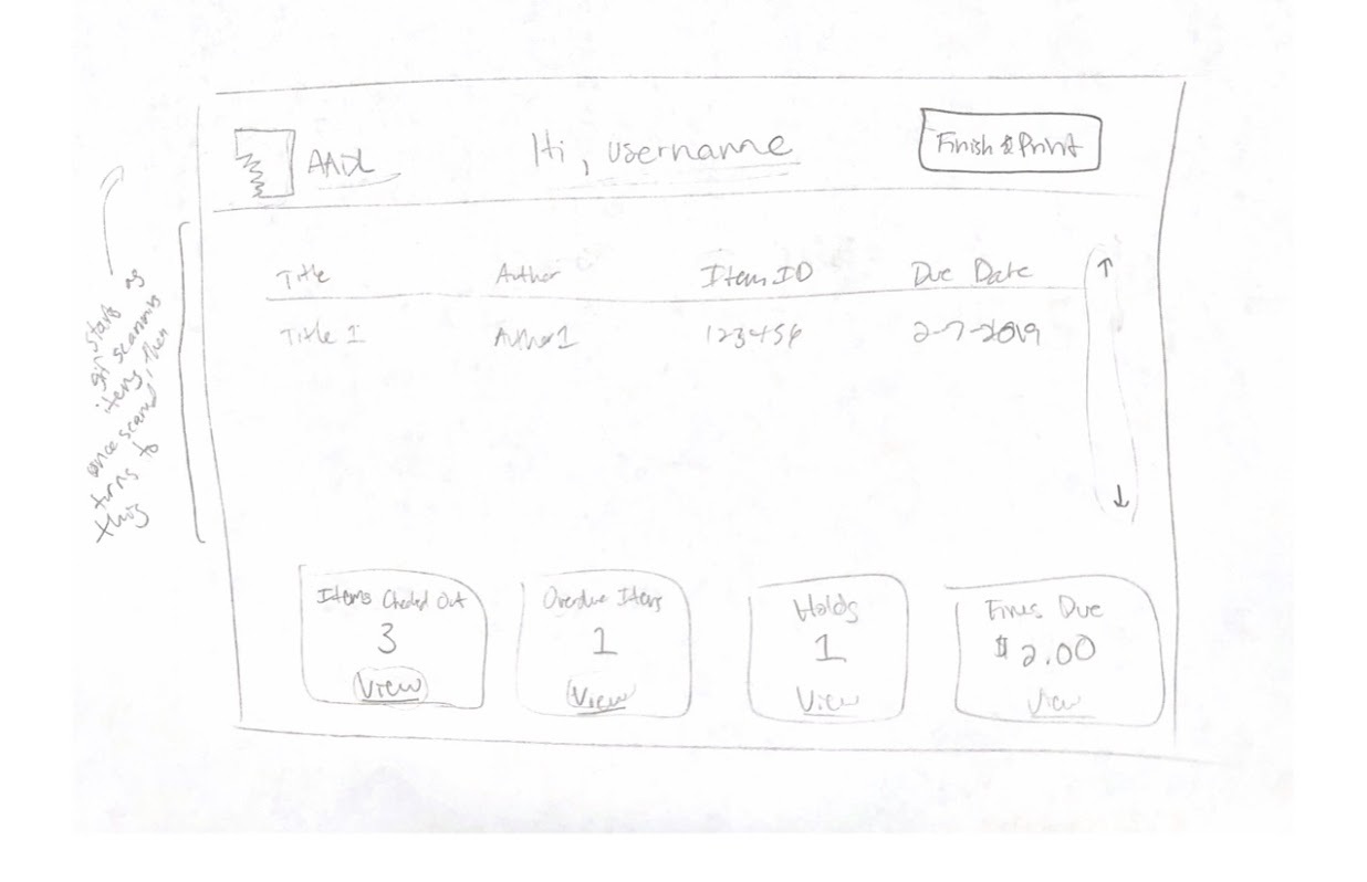
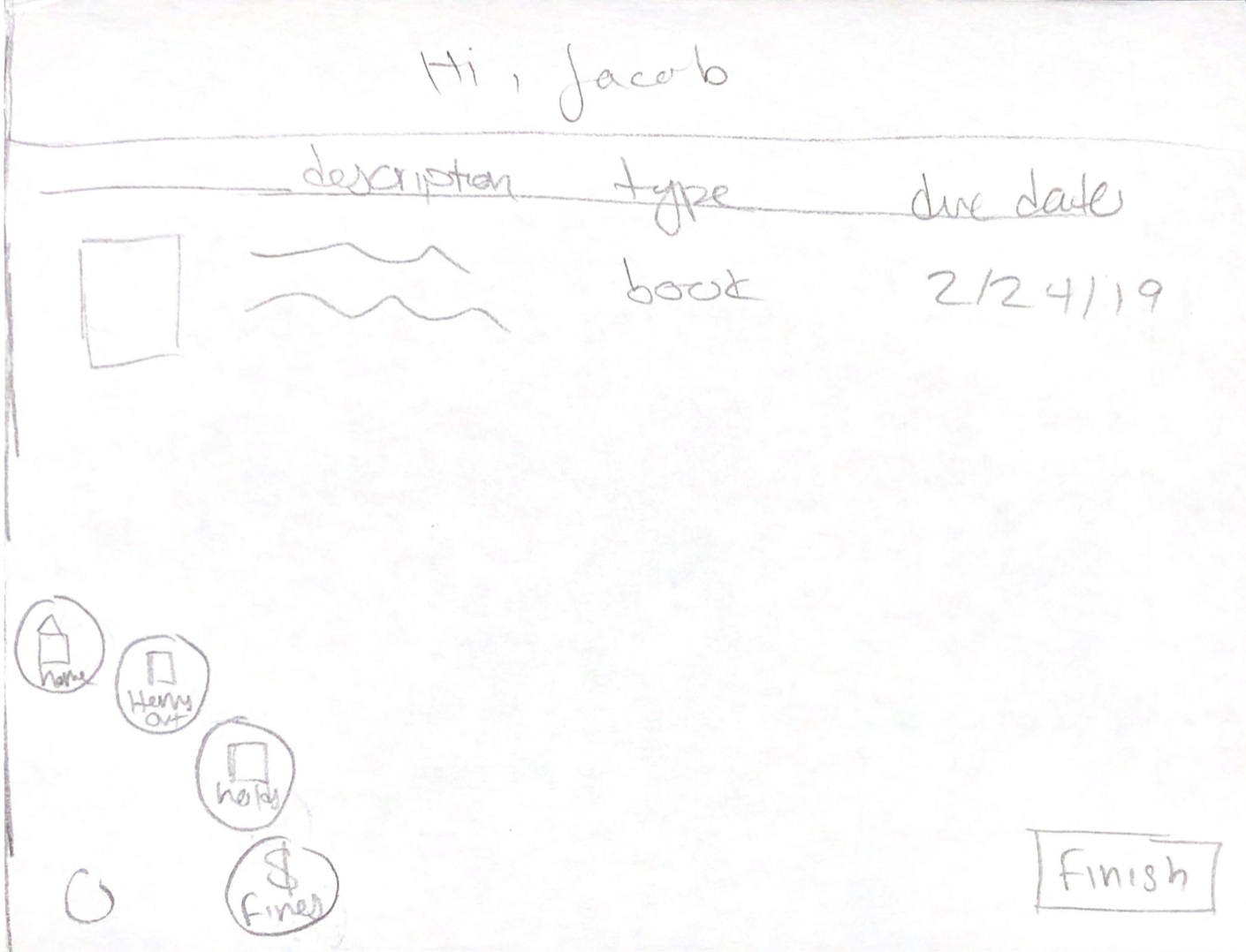
Low Fidelity, Paper Prototype: Our sketches were then implemented into a clickable paper prototype. The paper prototype allowed us to visualize the user flow and identify gaps that weren’t addressed in this stage of prototyping.
User Testing: From our user testing with our paper prototype, we realized that some of the terms were confusing with the subjects’ mental model. For example, the term Home was universally confusing for all three subjects—we’re considering My Cart, Current Session, or My Items.
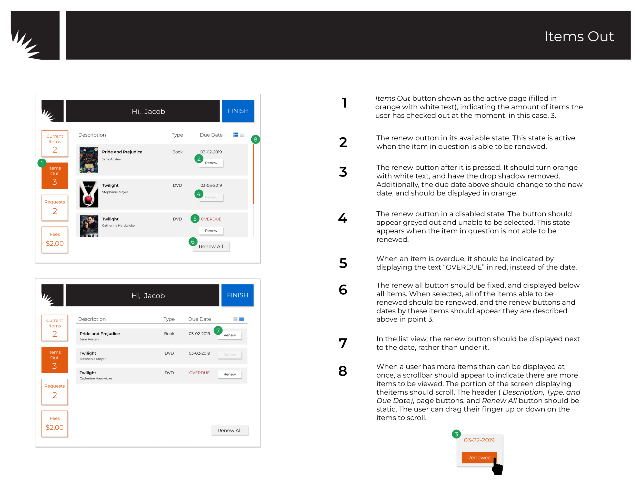
Two of the subjects had trouble completing the second task—renewing a book. Our team should reconsider how to better direct the users to the Items Out page if they need to renew items or change the term Items Out to something that clearly indicates that this page is where the renew function is held.
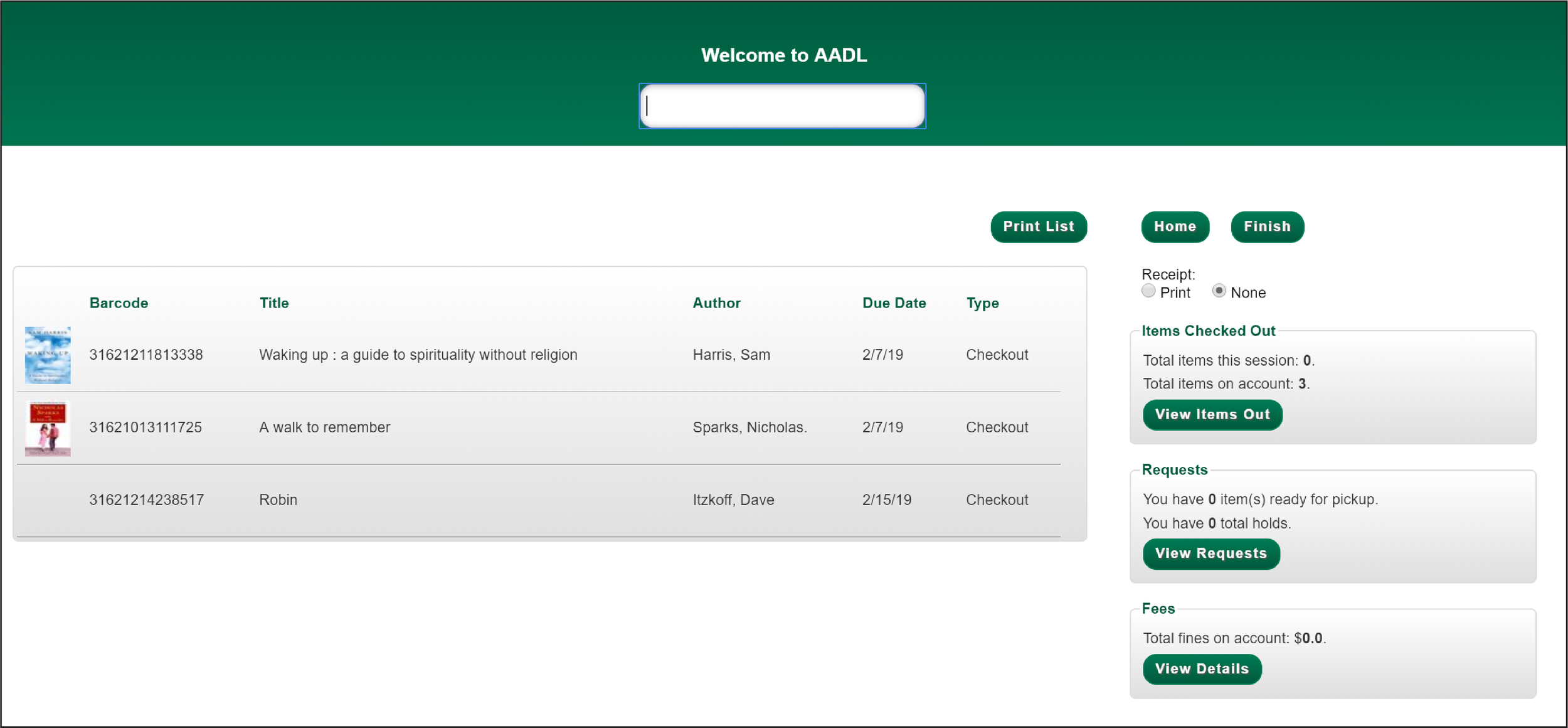
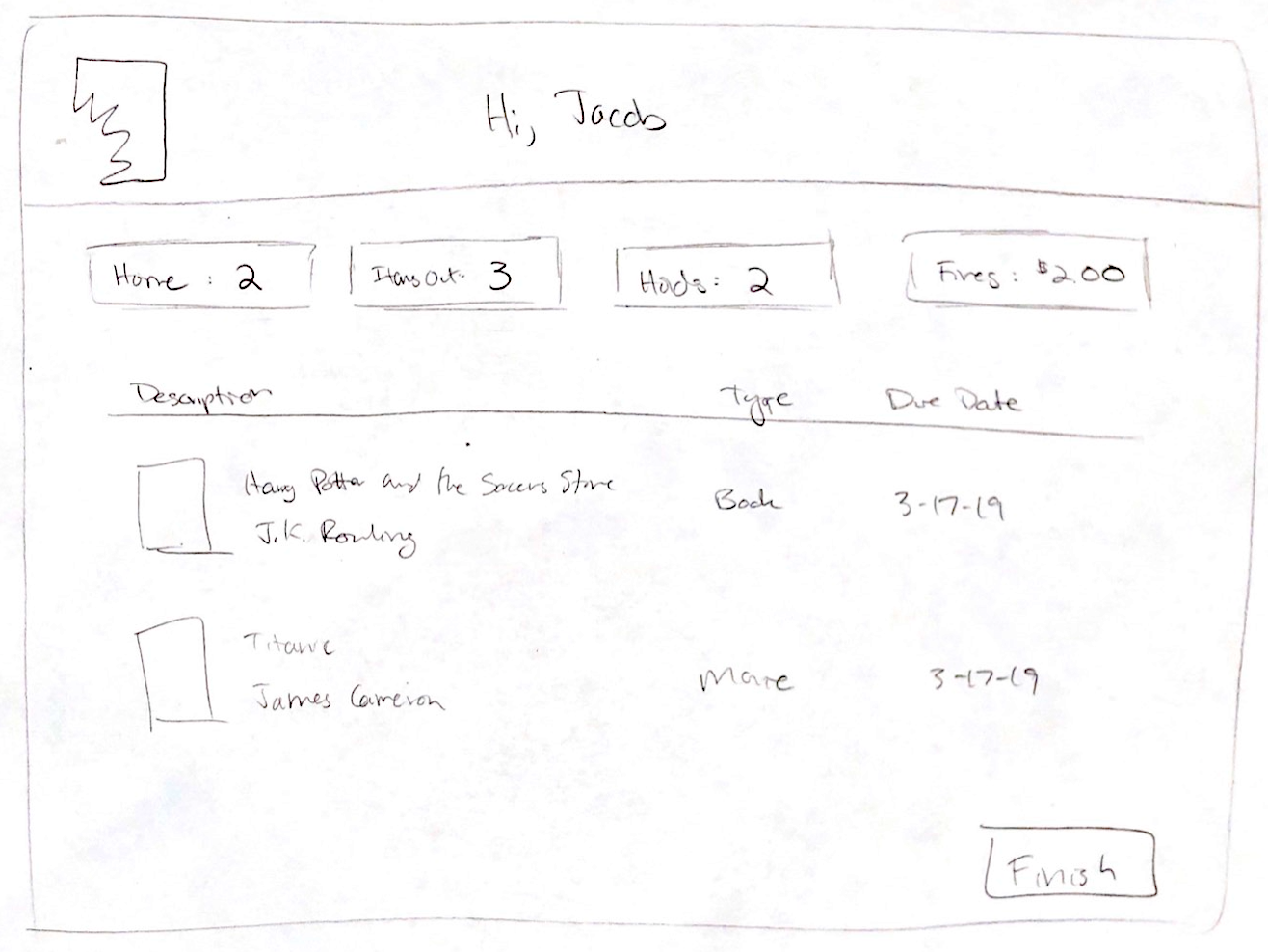
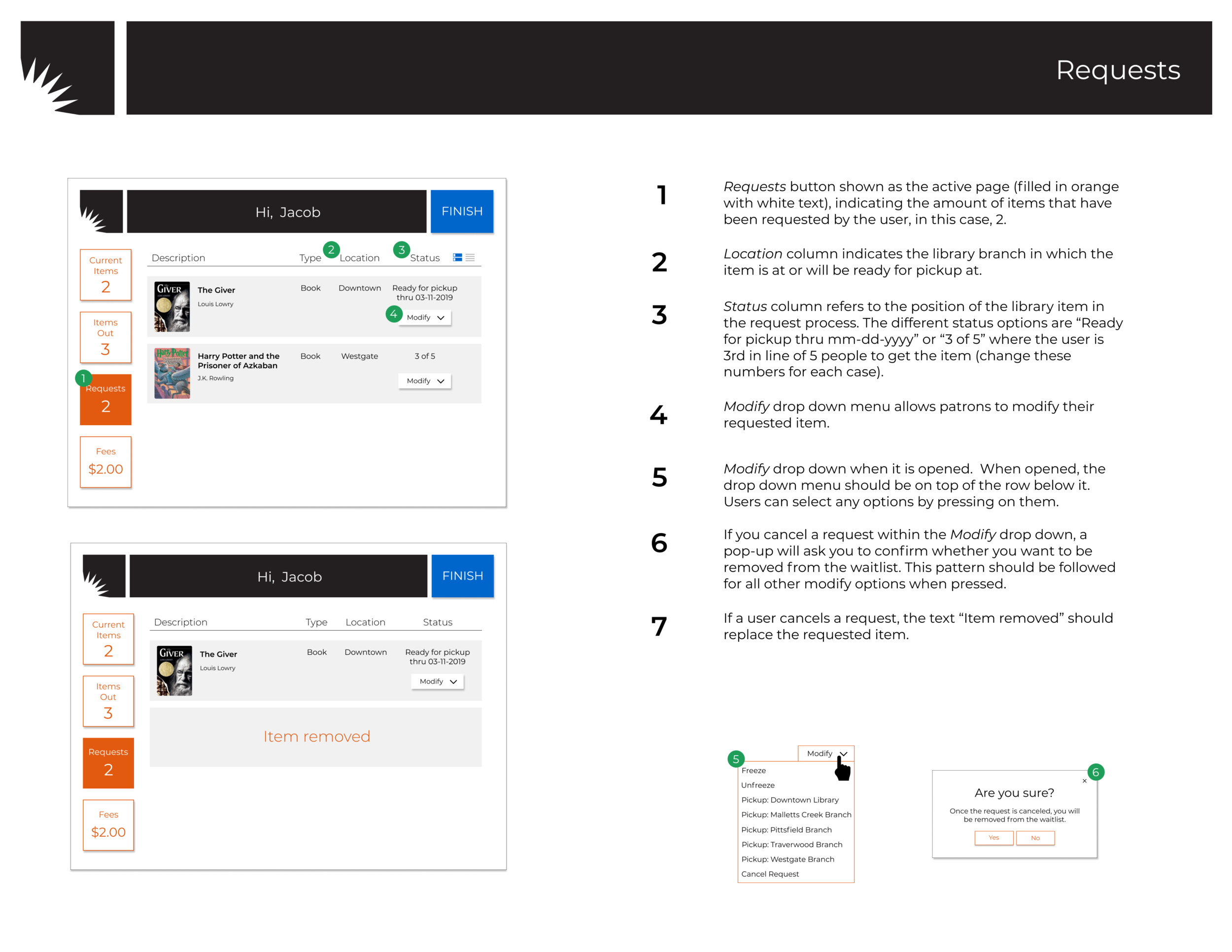
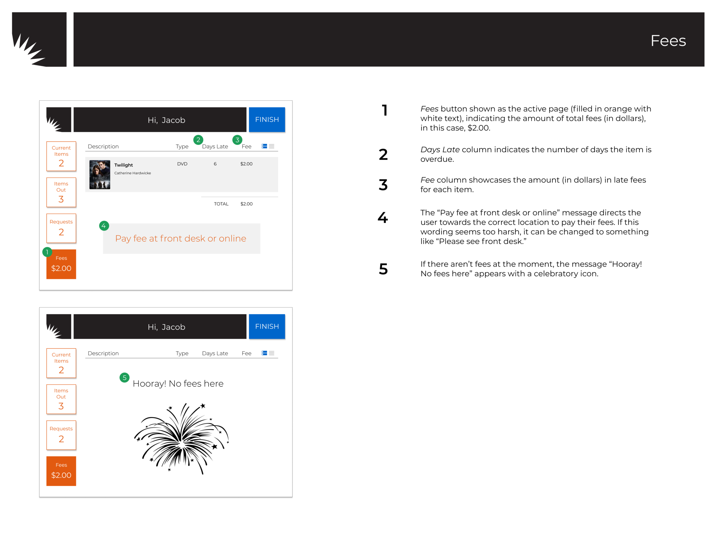
Client Feedback: Our client was most helpful in clarifying the word choices on our interface designs and explaining the functionality of certain self-checkout features. For word choices, he suggested that we change “Holds” to “Requests” and “Fines” to “Fees” to be consistent with the AADL jargon.
Additionally, our client explained the full functionality of the “Holds” page which our design was lacking. The page specifies the date for pickup, a patron’s place in line and allows patrons to modify their holds (freezing an item, changing the pickup location, etc.)
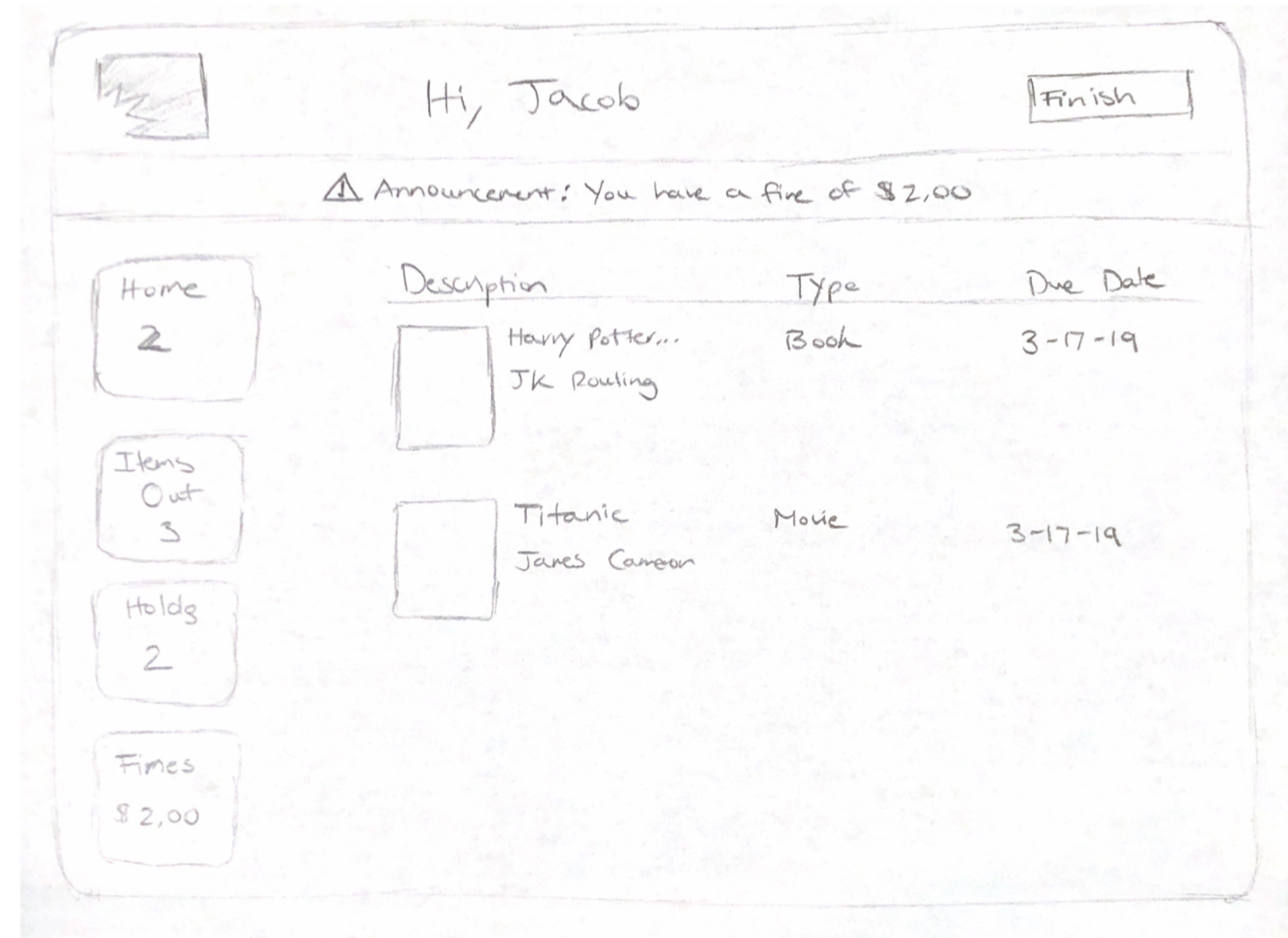
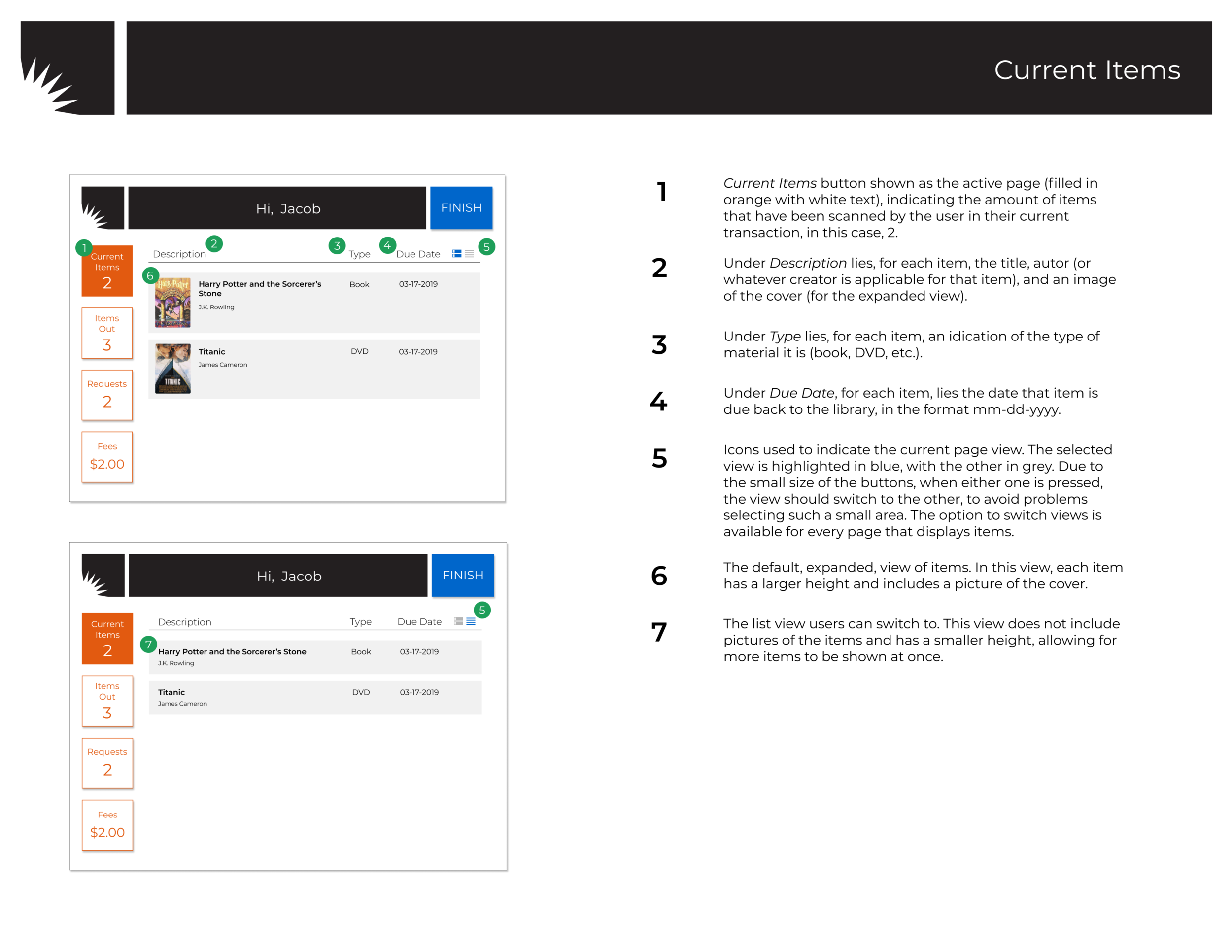
High Fidelity, Digital Prototype: Our digital prototype maintains the successful features from our paper prototype; it also has new additions and iterations based upon our user testing and client’s feedback. Also, the digital prototype follows the AADL brand guidelines and is thus ready to be implemented by developers.
User Testing: The digital prototype user prototype was smoother and more successful compared to the paper prototype testing. The renaming to “Current Items” instead “Home” was clearer to subjects and they expected their items they were currently checking out to be listed on the screen.
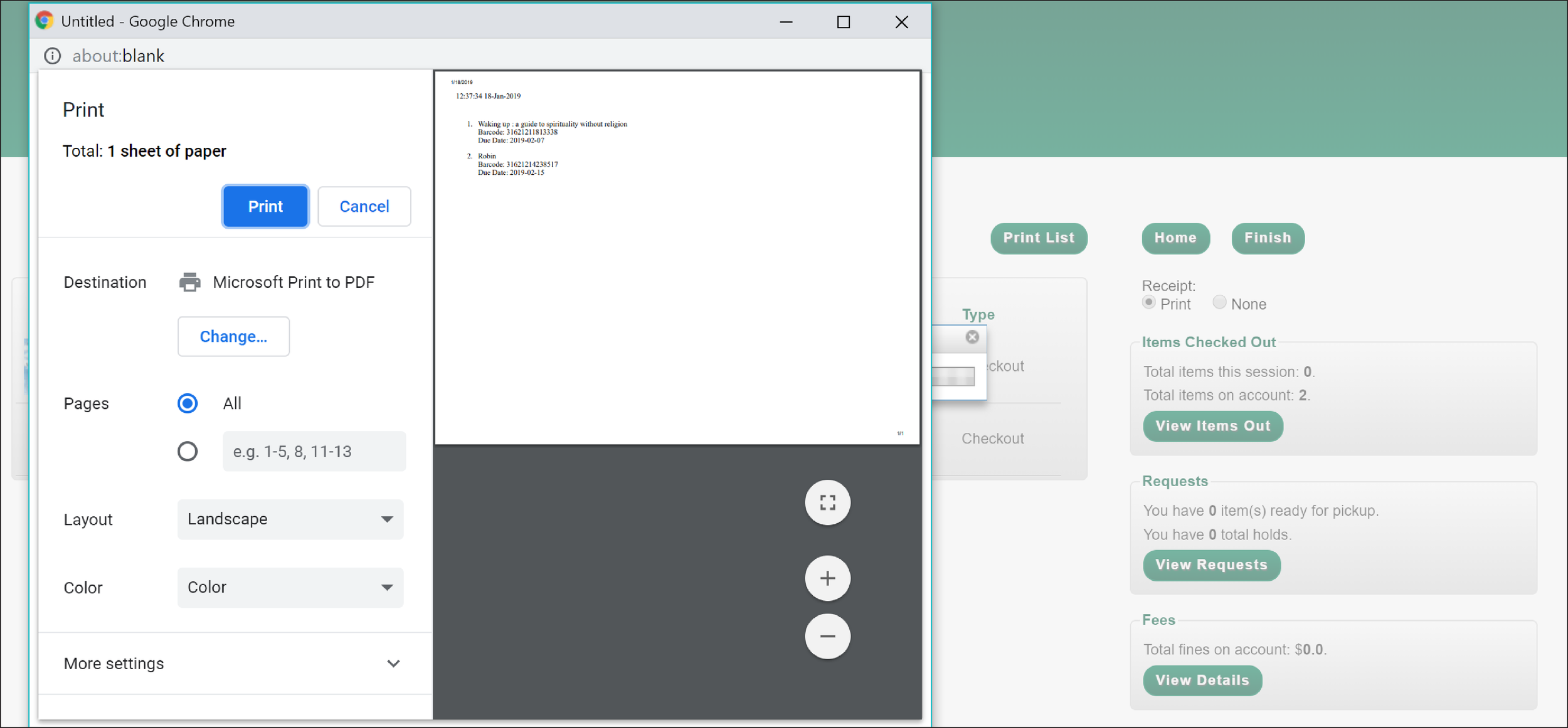
Client Feedback: Our client had general positive feedback and suggested a few minor changes. In the print pop up, he stated that it was a good solution to include the option to print out previously checked out items. For the “Items Out” section, he suggested adding a renew all button that would allow users with many checked out items to renew all at once. Additionally, he told us that most users know to drop off books at the drop box so the remove button on the “Current Items” page should be taken off.
Validation
Research Metrics: Our group developed a set of quantitative and qualitative metrics to evaluate the existing kiosk interface and our redesign.
Time (in minutes) to complete necessary tasks
Number of successfully completed tasks
Feelings of independence after self-checkout process
Overall convenience of self-checkout
Study Approach: We conducted between subject testing in a lab setting. Between subject testing reduces a possible priming effect in which users would be better prepared for completing tasks on the second interface after using the first one. Our group wanted to use a lab setting since we would be able to directly observe and interact with our subjects.
Study Materials: Our group developed an interview protocol and an end questionnaire for the validation study. The interview protocol prefaces the subject to the interface and and asks the subject to complete a set of tasks. The end questionnaire comprises mostly of the System Usability Scale (SUS) with two additional questions; it allows the subject to evaluate their overall experience.
Subject Recruitment: We were able to recruit participants over a wide range of ages and abilities. We had middle aged participants to represent our persona Melinda and college age students to mimic Jacob. Some of our participants were more fluent with technology than others, and most were semi-regular or regular library users.
Results and Analysis: Our group consolidated all of the validation testing data into a spreadsheet. We graphed certain metrics we note the quantitative differences between the existing and new interface. In order to meaningfully compare the results, we used statistical analysis methods.
Average Task Completion Time: The bar graph compares the average time taken to complete each task between the new and existing interface.

System Usability Scale (SUS) Scores: The SUS score box plots for the new and existing interface showcase the minimum, maximum, quartile, and median value for the range of scores.

T-test: We used a one tailed t-test to test that the time to complete each task on the existing interface is significantly greater than the time it takes to complete each task on our new interface.
Task 1: The t-value is 0.88423. The p-value is .196316. The result is not significant at p < .05.
Task 2: The t-value is 1.44926. The p-value is .085478. The result is not significant at p < .05.
Task 3: The t-value is 3.79061. The p-value is .001124. The result is significant at p < .05.
Task 4: The t-value is -0.52128. The p-value is .305469. The result is not significant at p < .05.
Task 5: The t-value is 1.29483. The p-value is .108953. The result is not significant at p < .05.
Task 6: The t-value is 0.04403. The p-value is .482774. The result is not significant at p < .05.
Insights: The average task completion rate was shorter with the new interface. Task 4 was an exception since the modify requests functionality wasn’t possible with the existing interface. However, the t-test revealed that the time difference for five of the six tasks was not statistically significant. This could be due to a small sample size or relatively small difference in time. Thus, we can conclude that new interface was more successful despite the lack of statistical significance.
The SUS box plots showed us that the scores and median were higher for the new interface while the old interface had a much wider range of scores. Based upon the individual responses to SUS questions, the new interface fostered greater confidence and less hesitation in completing tasks. Questions 3, 9, and 10 on the SUS scale generally scored higher with the new interface than the existing interface.
Design Handoff
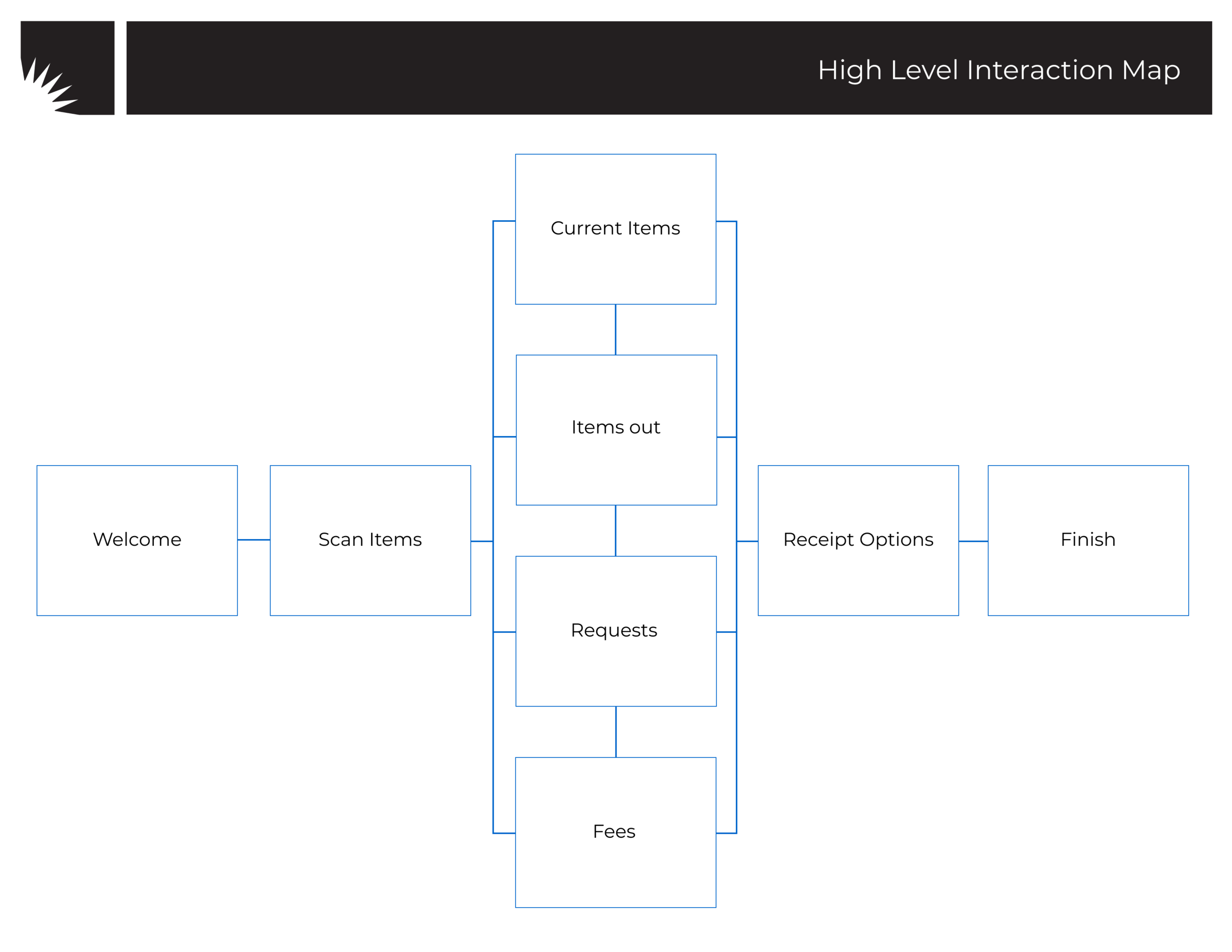
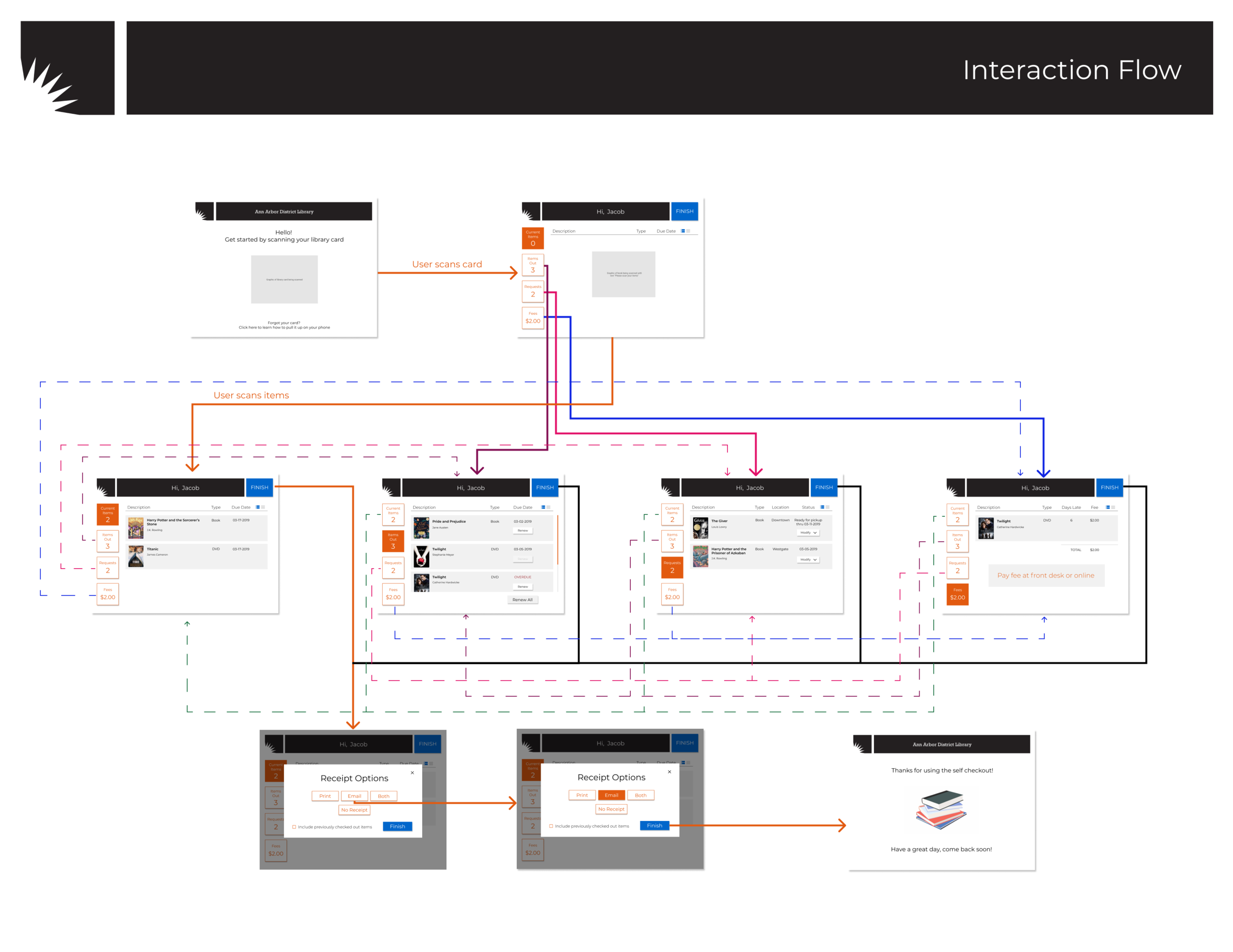
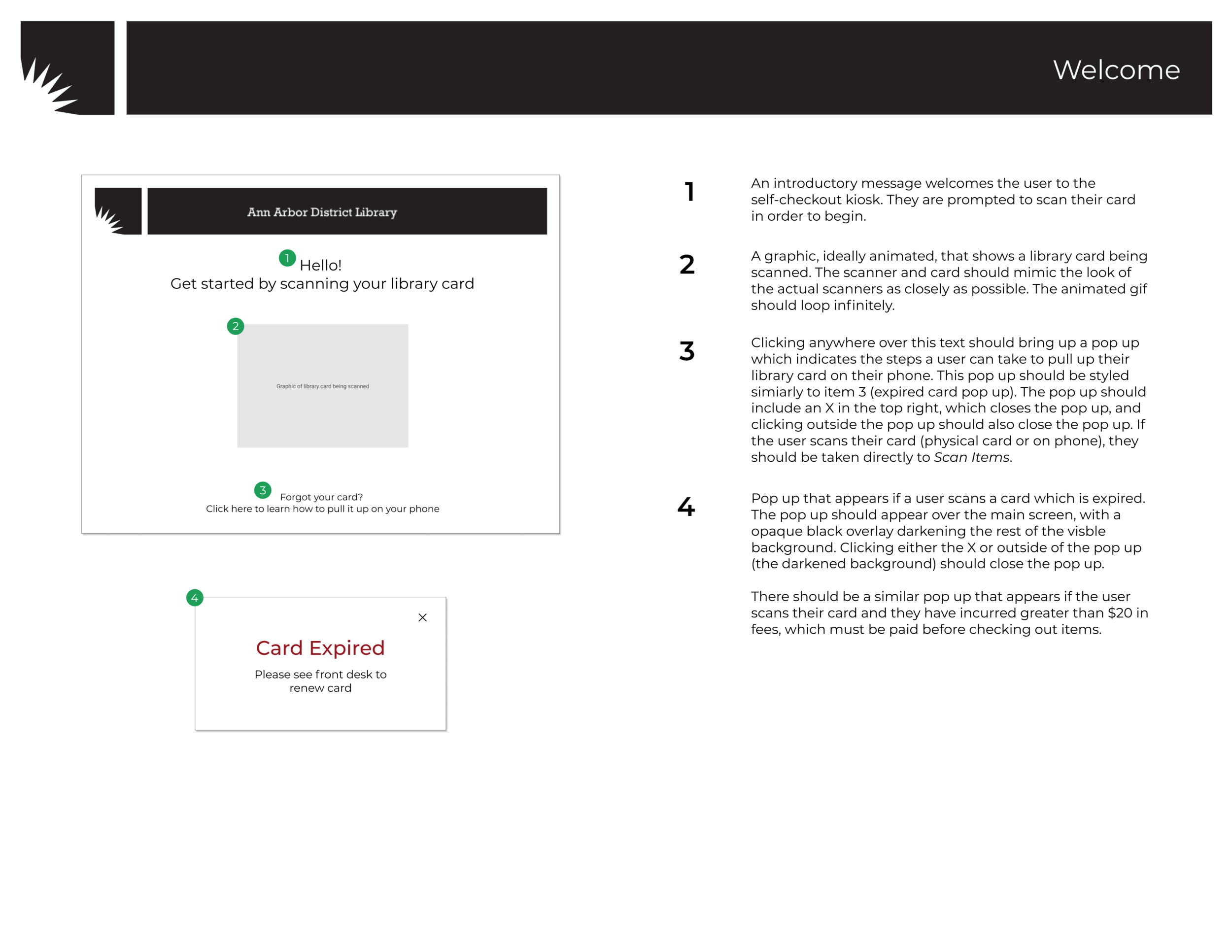
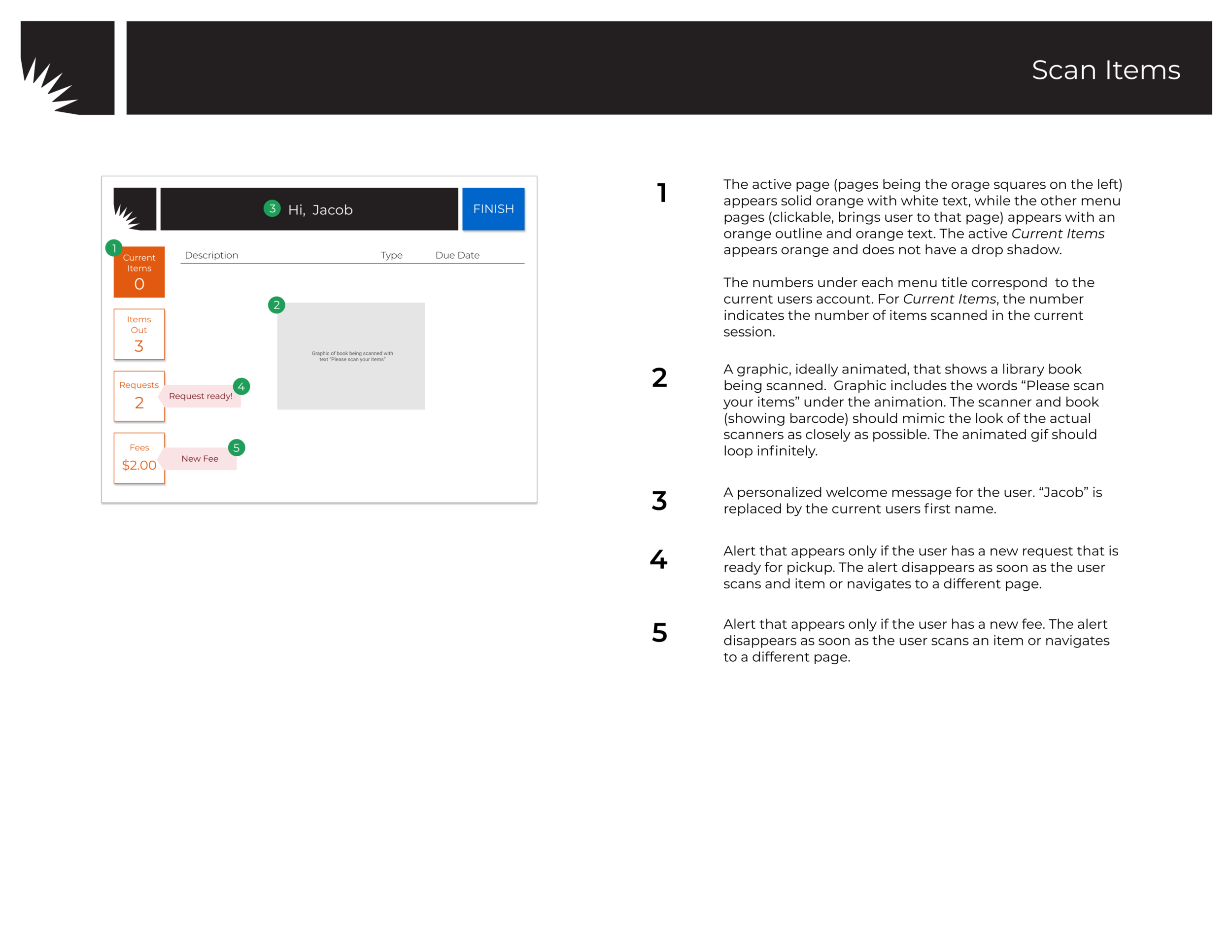
Design Specifications: At the end of the three phases, we developed high level interaction mappings and detailed screen specifications. The interaction mappings explain the flow and connection between the screens. The screen specifications detail interface design elements and their state changes. These documents will allow the AADL development team to accurately implement our designs.
Final Report: Our final report documents all of our work in a concise manner. The report contains an executive summary, overview of the three phases, final recommendations, and an extensive appendix.
Reflection
Design Process: Redesigning the self-checkout kiosk interface for AADL was particularly rewarding due to thoroughness of the overall process. Certain aspects of the research and validation phases were brushed over in my previous courses. Yet, this project allowed me to fully delve into both phases as a means of grounding and evaluating our design decisions.
Client Interactions: Working with a local, public library allowed us to conduct on-site observations of the kiosk space or interview staff to understand their perspective. Due to our close interactions with our client at AADL, we were able to very receptive of their needs and aimed to our interface design easily implementable.

Poster for the UMSI (University of Michigan—School of Information) Exposition

Project team (Left to Right: Kamden Hafke and Olivia Gardella) with poster presentation at the UMSI Exposition