
Hyecho's Journey
Problem Statement: Hyecho's Journey is an endeavor to address the current faults with the museum visiting experience: limited interactivity with the content, use of outdated technology and the lack of a lasting, educational tool. A team of seven students, two sponsors, and one faculty mentor worked alongside the Freer|Sackler Galleries at the Smithsonian Museum to develop digital applications for these pain points.
Team Structure: Part of an interdisciplinary student team with four software developers and three UX Designers/Researchers. Mentored by faculty members organizing the Hyecho’s Journey exhibit and from the EECS department.
My Role: Lead Visual and UX Designer
Tools: Sketch and InVision
Deliverables: Hyecho's World (iPad app) and Hyecho's Journey (iPhone app)
Timeline: 1/2017 to 12/2017
Recognition: The UM LSA college described the importance of our sponsors’ research in the field of Asian and Buddhist studies. The UM EECS department featured the student team’s work. The Freer|Sackler Galleries discussed our apps' use within the museum space.
A Personalized Interactive Guide to an Exhibition—an academic paper written by the Hyecho’s Journey team—was accepted into the Digital Cultural Heritage International Conference at Berlin, Germany.
Hyecho's Journey App
Hyecho's World App
Research and Scoping
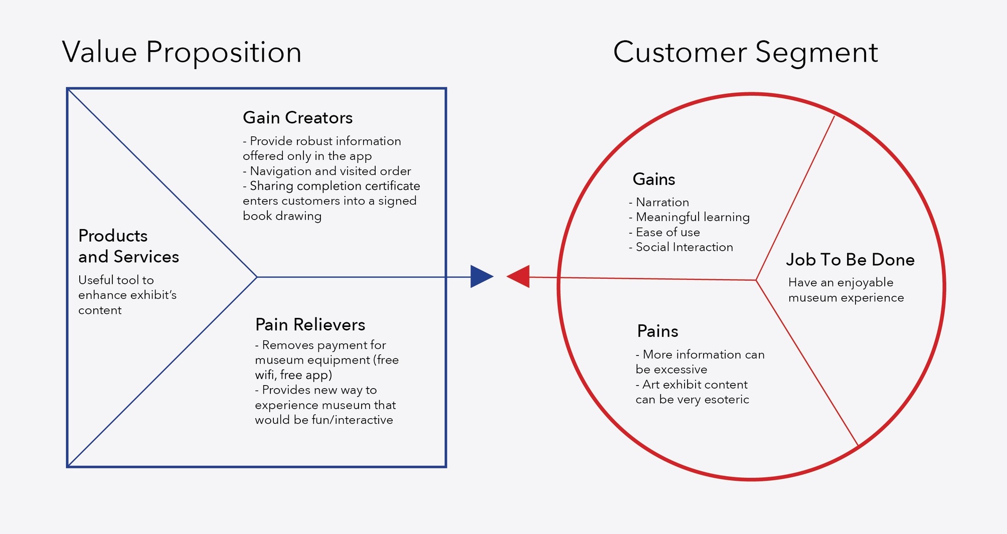
Value Proposition Canvas: The Value-Proposition Canvas frames the potential and purpose of our app. We conducted 21 in person interviews and gathered additional responses through Google forms in order to understand user's expectations of a museum guide app. After analyzing the responses, we deduced that we needed to increase users' interactivity with the museum's artifacts and include additional pertinent information to better contextualize Hyecho's Journey and the artifacts he encountered.
Competitive Analysis: We looked to existing museum guide apps as a source of reference. We noted interactive features such as gamification, virtual reality, scavenger hunts, etc. that successfully enhanced the visitor experience. Additionally, we wanted to understand how other apps integrated the physical museum space with a digital application—as this was a core requirement by our sponsors and the Freer|Sackler Galleries.
Freer|Sackler Galleries Data: The Freer|Sackler Galleries provided over 1500 entrance-exit surveys, observational studies, and a compilation of over 70 interviews. The Freer|Sackler's data proved to be extremely useful in understanding our core demographic and typical user behavior patterns.
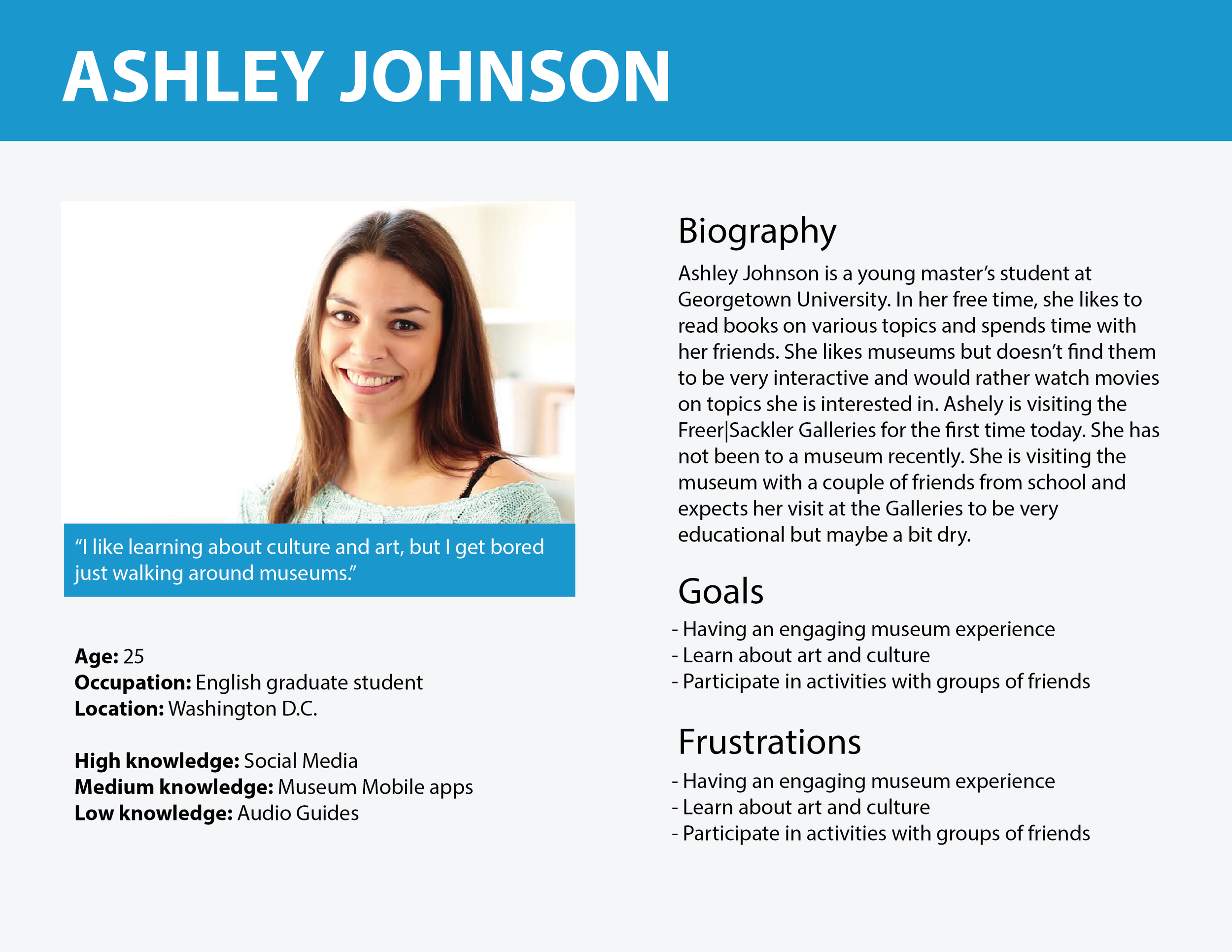
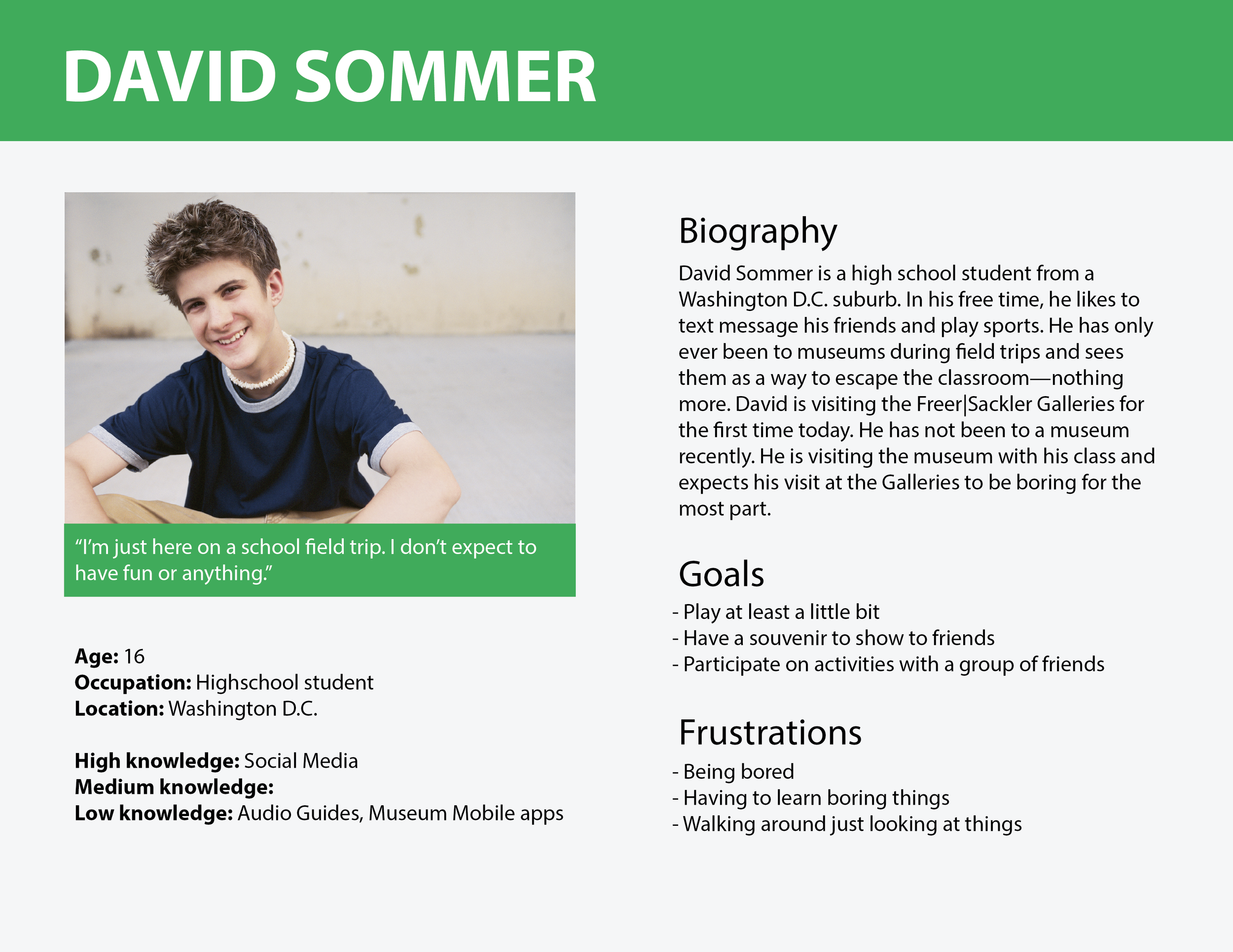
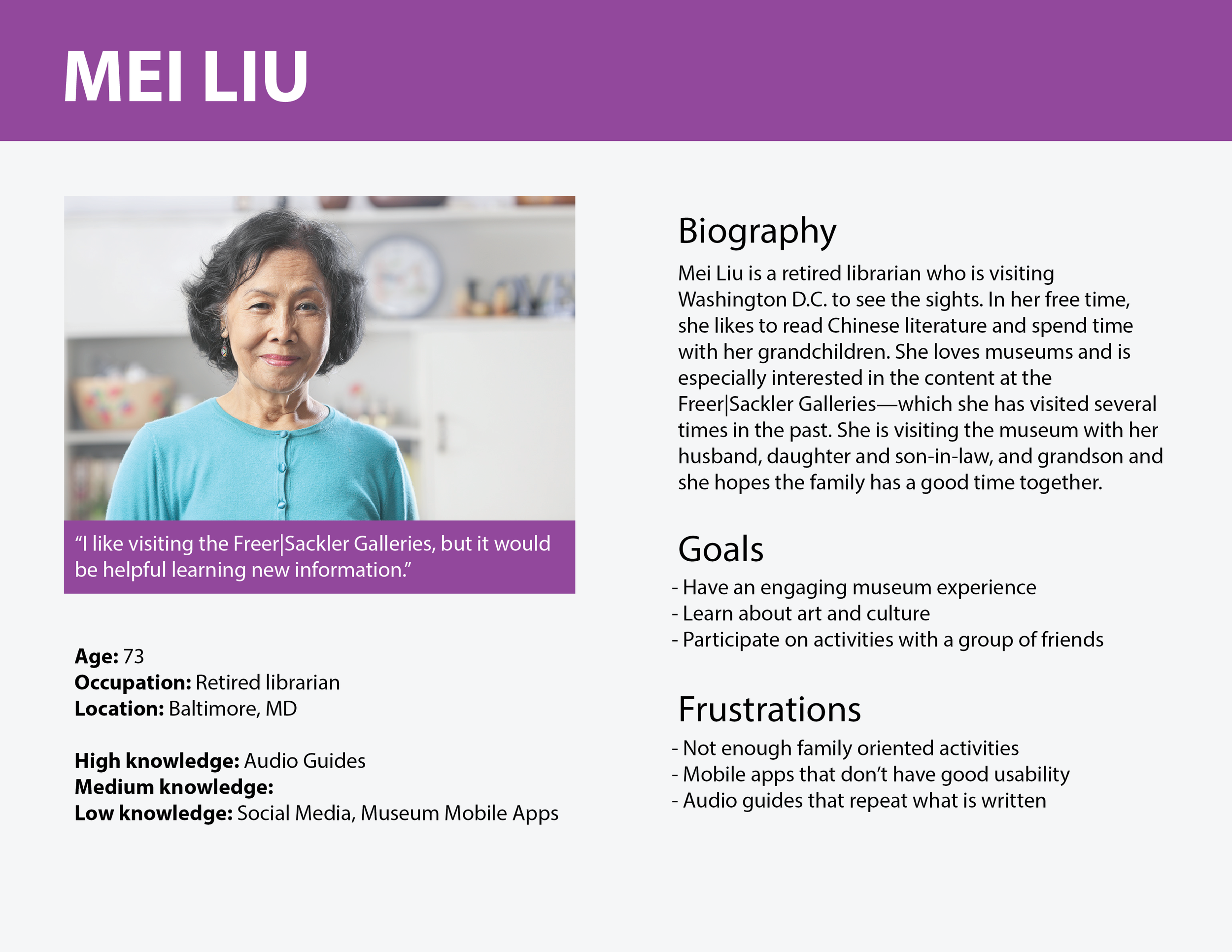
Personas: Using the Freer|Sackler's demographic information and our own research statistics, we defined three key personas: Ashley Johnson, David Sommer, and Mei Liu. The three personas all hope to use the app in order to enrich and gain the most of their trip to the Freer|Sackler Galleries. However, they differ in their comfortability with technology and exhibit visiting intentions.
Journey Map: A journey map for our main persona—Ashley Johnson—revealed the various touch points in which she would encounter our app as well as the pain points that would cause her aggravation.

Brainstorming and First Iteration
Storyboards: Defining the features during our research phase allowed us to frame our app's user flow. We wanted to lead our users through a journey—metaphorically and physically. We wanted to lead the users through the museum space as well while making them a part of Hyecho's pilgrimage through Asia. Our sketches and storyboards integrate narrative, interactive features, gamification etc.
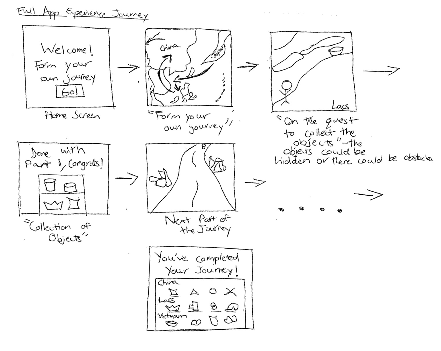
![[Untitled] (26).png](https://images.squarespace-cdn.com/content/v1/597e6796a5790a1f46ac8ebc/1557176231333-P2YR4XUSL9YAKKXU3WF6/%5BUntitled%5D+%2826%29.png)
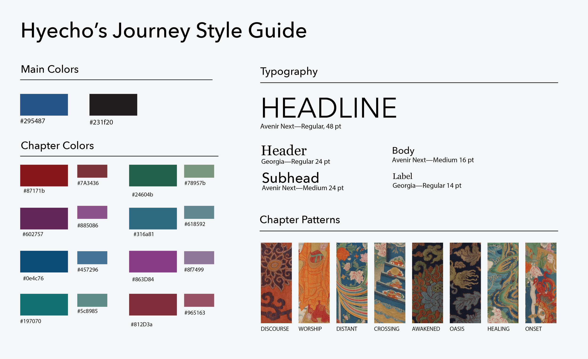
Visual Style Guide: The visual elements choices were crucial in developing the overall tone for the app and its subject matter. Our team consulted with the designers at the Freer|Sackler Galleries to align our brand identity with theirs. The choice of a muted color palette and elegant typefaces creates an inviting environment within the app.

Low-Fidelity Prototype: Since the concept of pilgrimage is central to our project, the first option in our app is a structured journey that ties all of the exhibit objects in a geographical context. The second option is more self directed; users are able to browse and search for items within an object inventory. To engage visitors—especially like our younger persona, David—we designed engaging interactions to provide interesting facts about the objects. Additionally, we decided to include leveled audio guides so that users would be able to choose their desired amount of information.

Second Iteration
Unexpected Changes: At the end of April, our student team had its first video meeting with the Freer|Sackler staff. As our meeting progressed, it was evident that we weren't on the same page in terms of the Hyecho's Journey's app. The meeting revealed that the Freer|Sackler staff were a much larger stakeholder in the project than we understood. After the meeting, the student team sought to address the misunderstandings by pivoting our app in a new direction.
1. To our surprise, the Freer|Sackler was developing a series of "podcasts" that will serve as 20 minute audio guides. Thus, our initial idea for the iPhone app overlapped too much with their product.
2. The Freer|Sackler staff wanted an iPad app to run on tethered iPads beneath Hyecho's statue. Our student team was not aware of this requirement and now we needed to develop two apps: an iPad app for the Freer|Sackler's iPads and an iPhone app for exhibit visitors and others interested in Hyecho.
3. We were informed that only 8 objects in the exhibition—instead of all 21—were related to Hyecho. Thus, our original object groupings were no longer relevant with the exhibit's content.

Visual Style Updates: We maintained the understated visual tone from the first iteration. We changed our serif typeface from Baskerville to Georgia for increased legibility. Additionally, we focused on developing a visual style within each chapter. Each chapter features two complementary colors and a pattern—cropped from an image of a tapestry in the exhibit.
High-Fidelity Prototype: Our higher fidelity prototypes were entirely restructured from our original iteration. We still maintained the idea of a structured journey and a self-directed path. However, we now organized the exhibit objects around chapters with eight chapters in total. Each chapter features one object; accompanying text and audio elaborate on the object and Heycho’s connection to the object. Additionally, the mini-game within each chapter contextualizes the object for the user and provides additional information.
User Testing
Affinity Diagram: With our completed app, we conducted 9 structured usability tests. Additionally, we conducted guerrilla user testing at the UM Museum of Art. We coded the user’s feedback and organized them in an affinity diagram. The criticisms centered around the object interactions. Several subjects commented there was a disconnect between the high-level content on Buddhism and the childlike mini-games. Additionally, technical issues and low quality graphics led to many users calling the interactions "hokey" and "gimmicky."
Updates Based on User Feedback: Our team renamed the term "interactions" to "mini-games." Framing the interactions as mini-games validates its playful quality and distinguishes it from the otherwise academic content. The designers worked with the developers to adjust the mini-games' user flow and create a seamless experience. Also, one of designers developed hand-drawn illustrations for the mini-games to create a charming atmosphere within the app.
Navigation A/B Test: With the second version of our app, we added more content. With additional content, there is an increased need to go back and forward between these pages. Also, we wanted our app's navigation to work with the release of newer iPhone models. With the larger iPhone screen sizes, pertinent features are increasingly placed at the bottom of the screen—closer to the thumb.
Original (Second): Bottom navigation bar and top status bar with a back button.
Updated Version (First): Back and forward buttons at the bottom and use the hamburger menu to contain pages that will not be frequently used.
Outcome: Users preferred the bottom back and forth button with hamburger menu—the updated version. In our latest testing with the launched app, over 85% of users do not have any difficulties navigating the app.

Final Presentation and Reflection
The Hyecho’s Journey project challenged me in communicating my design decisions to developers and external stakeholders. It was also the first time my designed interfaces were implemented by developers and used in the form of a functional product.
As a designer, I realized the importance of understanding development constraints when designing mockups. I would run the designed assets by the developers before they were implemented. The continuous dialogue with the developers allowed me to quickly address potential issues and save time by not having to redesign certain assets after they were implemented.
The coordination between the Freer|Sackler Galleries, the sponsors, the faculty mentor, and our student team required committed time and effort in order to be successful. The student team, faculty mentor, and sponsors had weekly meetings in which we went over the apps’ progress. The student team also directly had meetings with the Freer|Sackler’s digital media team. By the digital media team, we were informed of potential technical issues at the Freer|Sackler Galleries and of necessary design changes.
Being a member of the Hyecho’s Journey project and a designer for its apps has been one of my most memorable experiences at the University of Michigan. The opportunity to work on Hyecho's Journey and Hyecho's World for an entire year allowed us to deliver the best possible versions of our apps—in terms of usability and technical functionality. Our successful apps showcase that interdisciplinary collaboration leads to robust work representative of multiple perspectives.

Hyecho's Journey presentation poster for the Multidisciplinary Design Program Expo

Student Team (Left to Right: Rebecca Henry, Elijah Sattler, Sindhu Giri, Eric Yeh, Anders Boberg, Bailey Case, and Wei Cai) and Faculty Mentor (Sugih Jamin) presenting the apps at the Freer|Sackler Galleries